White Space is Not Your Enemy
What is Graphic Design? Making Visuals & Type Play Nice in Space
- Graphic design refers to a plan for organizing visual objects in space (usually a two-dimensional plane such as paper or screen).
- The function of graphic design is to communicate messages visually.
- The three building blocks of graphic design are visuals, typography and negative space.
- Learn the rules for combining visuals, typography and negative space into functional visual communication before taking creative license to break the rules.
- Good graphic design does four things:
- It captures attention.
- It controls the eye’s movement across the page or screen.
- It conveys information.
- It evokes emotion
Step Away From the Computer for Research & Brainstorming
|
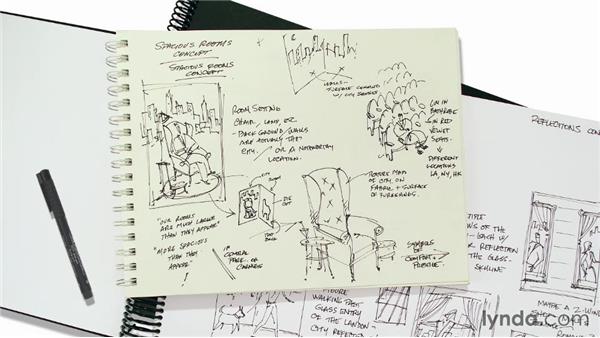
Students resist the idea, let alone the practice, of starting design projects with the computer turned off. This chapter emphasizes the research, brainstorming and sketching designers do before they open their design software applications.
Key Takeaways Great design always begins with research to answer standard questions that may become part of a document called a design brief or creative brief:
|
The brainstorming process involves first doing a fluent-thinking mind-dump, second using split focus to percolate ideas on the back burner and third actively morphing “it” (whatever “it” is) into something else. Repeat as necessary.
Designing with the computer turned off includes using thumbnail sketches to test (and reject) layout possibilities quickly. Designers also sketch dummies for newspapers, magazines and newsletters; storyboards for animation and video; and site maps and wireframes for Web designs. |
I Need to Design This Today: Works-Every-Time-Layout
The works-every-time layout allows us to describe Western layout in its most universal form while also teaching introductory rules for working with type, visuals and negative space. At the end of this chapter students have a working vocabulary of layout and can produce functional—if generally dull—layouts.
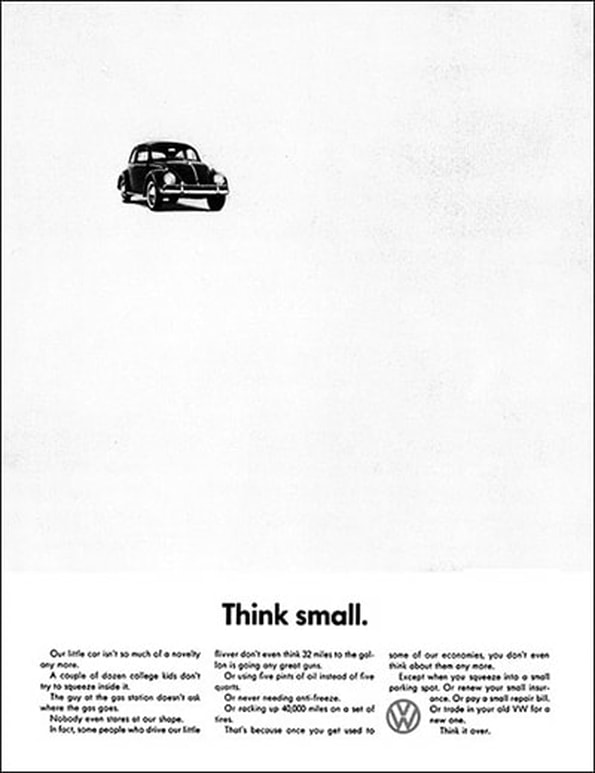
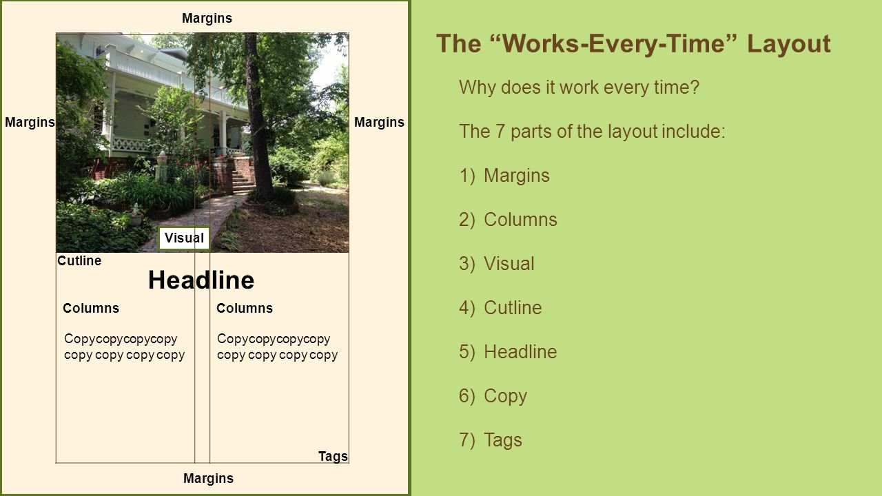
1. The WET layout works because of the order in which Westerners learn to read. We are taught to “enter” a page in the upper left-hand corner and to “exit” the page in the lower right-hand corner. This reading pattern or eye flow dictates the placement of visuals and type on a WET layout: Visual first at the top, headline next under—not over—the visual, body copy last under the headline.
2. The 6 steps of the WET layout are:
3. Margins, sometimes called thumb space, frame the design with negative space and buffer it from surrounding visual clutter.
4. Because people are lazy readers, designing with columns tricks the eye into reading more than it might otherwise.
5. The visual at the top of the WET layout acts as the eye’s entry point and focal point into the layout. Make the visual a welcome sign to the layout.
6. In a WET layout, pairing two different fonts that play well together is best. Choose an interesting font for the headline and an easy-to-read font for the body copy. Then use one or the other font in the caption/cutline and/or tags.
7. In the WET layout, the caption or cutline typically appears directly beneath its photo or visual. Set cutline type somewhere between 9 and 11 points. Position the cutline to sit flush left/ragged right, and match the width of the cutline to the width of the photo or visual.
8. Headlines are the second most important visual component on a WET. Make the headline point size big so that it draws the eye down from the visual toward the body copy. Choose an interesting headline font to match the layout’s tone. Let the headline’s copy suggest where to break a long headline into multiple lines.
9. There are some basic rules for setting up and positioning body copy:
10. If tags are required, as in advertising, be sure to include the logo and URL.
11. Just because the WET layout works every time, don’t assume you must or should use it every time.
1. The WET layout works because of the order in which Westerners learn to read. We are taught to “enter” a page in the upper left-hand corner and to “exit” the page in the lower right-hand corner. This reading pattern or eye flow dictates the placement of visuals and type on a WET layout: Visual first at the top, headline next under—not over—the visual, body copy last under the headline.
2. The 6 steps of the WET layout are:
- Step 1: Determine the outer boundaries of the design and lay in generous margins on all four sides of the layout.
- Step 2: Establish column guides.
- Step 3: Position the visual at the top of the page to function as the focal point that captures attention. If applicable, place the caption, known in news as a “cutline,” under the visual.
- Step 4: Position the headline under the cutline.
- Step 5: Position the body copy into columns under the headline
- Step 6: If applicable, place tags in the bottom right corner, as the last thing the eye sees before exiting the page.
3. Margins, sometimes called thumb space, frame the design with negative space and buffer it from surrounding visual clutter.
4. Because people are lazy readers, designing with columns tricks the eye into reading more than it might otherwise.
5. The visual at the top of the WET layout acts as the eye’s entry point and focal point into the layout. Make the visual a welcome sign to the layout.
6. In a WET layout, pairing two different fonts that play well together is best. Choose an interesting font for the headline and an easy-to-read font for the body copy. Then use one or the other font in the caption/cutline and/or tags.
7. In the WET layout, the caption or cutline typically appears directly beneath its photo or visual. Set cutline type somewhere between 9 and 11 points. Position the cutline to sit flush left/ragged right, and match the width of the cutline to the width of the photo or visual.
8. Headlines are the second most important visual component on a WET. Make the headline point size big so that it draws the eye down from the visual toward the body copy. Choose an interesting headline font to match the layout’s tone. Let the headline’s copy suggest where to break a long headline into multiple lines.
9. There are some basic rules for setting up and positioning body copy:
- Choose an easy-to-read font (a “transparent” font).
- Set body copy somewhere between 9 and 11 points.
- Keep the headline and lead together.
- Never indent the lead paragraph.
- Lay body copy into columns wide enough to accommodate 6–12 words per line.
- Keep columns of type, called legs, taller than 2 inches but shorter than 10–12 inches.
- Size automatic paragraph indents proportionately to point size and line length.
10. If tags are required, as in advertising, be sure to include the logo and URL.
11. Just because the WET layout works every time, don’t assume you must or should use it every time.
Layout Sins: 13 Amateur Errors
Let's pre-empt the 13 most common bad habits we see in bad design work.
The 5 steps to visual success are:
- Avoid centered layouts.
- Keep photographs proportionate, and use hairline rules to border photos that have ambiguous edges.
- Stick to two fonts per layout.
- Use negative space to group or separate things. If you must use a border or box, choose an understated one.
- Be generous with margins, including inset and offset for text and picture boxes.
- Keep headlines in a straight line.
- Clutter: Bad. Clustering: Good.
- Push extra negative space to the outside edges of your layout.
- Design backgrounds as negative space. Save tiling for the bathroom.
- Think twice about reversing, stroking, using all caps or underlining.
- Use real bullets for lists, and use hanging indents to align bulleted lists properly.
- Avoid inelegant breaks at the bottoms and tops of legs of type.
- Avoid unsightly rivers of negative space flowing through legs of justified type.
The 5 steps to visual success are:
- Establish a clear focal point.
- Minimize the number of groupings the eye must scan.
- Guide the eye with visual sightlines.
- Set type properly.
- Use simplicity and restraint.
